Adobe InDesign has traditionally been built around precise positioning.
You create a text frame, place it exactly where you want it, add an image beside it, and carefully control the spacing between every element.
That approach remains one of InDesign’s greatest strengths.
But it also creates a problem.
What happens when the content changes?
A two-line heading becomes four lines. A product description becomes twice as long. A translated paragraph needs more space. An image changes dimensions. Suddenly, the carefully positioned layout needs manual adjustment.
Flex Layout in Adobe InDesign is designed to solve this kind of problem.
Flex Layout lets you arrange objects using relationships and layout rules rather than relying entirely on fixed coordinates. Elements can respond more intelligently when their content or container changes.
For beginners, this introduces a new way of thinking about InDesign.
Instead of asking only:
Where should this object be positioned?
you can begin asking:
How should this object behave when the content changes?
This guide explains the fundamentals.
What Is Flex Layout in Adobe InDesign?
Flex Layout is a responsive layout feature that lets groups of InDesign objects behave according to defined layout rules.
Imagine a simple product card containing:
- product image
- product name
- description
- price
- button
In a traditional layout, you might position each item manually.
The product name starts at a particular Y coordinate.
The description starts at another coordinate.
The price appears at another.
Everything works perfectly until the product name becomes longer.
The heading grows downward, but the description doesn’t automatically understand that it should move.
Flex Layout changes this relationship.
Objects can participate in a flexible container where their arrangement is controlled by properties such as:
- direction
- spacing
- alignment
- distribution
- wrapping
- sizing
The layout becomes more responsive to its content.
Why Did Adobe Add Flex Layout?
Modern publishing is becoming increasingly dynamic.
Designers are no longer always creating one fixed document containing completely predictable content.
They may be creating:
- automated catalogs
- multilingual publications
- reusable templates
- personalized marketing materials
- responsive digital publications
- data-driven reports
- AI-assisted content
- multiple versions of the same document
All of these workflows introduce variation.
Traditional fixed positioning can require substantial manual correction when the content changes.
Flex Layout helps InDesign templates tolerate more of that variation automatically.
The Key Concept: Relationships Instead of Coordinates
Understanding this idea makes Flex Layout much easier.
Suppose you have a heading and paragraph.
With traditional positioning, you might effectively tell InDesign:
Put the paragraph 65 mm from the top of the page.
With flexible layout thinking, the rule becomes closer to:
Put the paragraph below the heading with 8 mm of spacing.
The first rule depends on a fixed location.
The second depends on the relationship between two objects.
Now imagine the heading becomes taller.
With fixed positioning, the paragraph remains where it was.
With a flexible relationship, the paragraph can move to accommodate the heading.
That’s the foundation of Flex Layout.
If You Know CSS Flexbox, This Will Feel Familiar
Web designers may recognize the concept immediately.
CSS Flexbox allows web elements to be arranged inside containers using rules for:
- direction
- alignment
- spacing
- distribution
- wrapping
InDesign Flex Layout follows a similar general philosophy, although it is implemented for InDesign’s visual publishing environment.
You don’t need to know CSS to use Flex Layout.
But if you’ve worked with Flexbox before, the mental model should feel familiar.
What Is a Flex Container?
The Flex Container is one of the most important concepts to understand.
A container holds the objects that should participate in the flexible layout.
Imagine this simple component:
Product Card
→ Product image
→ Product name
→ Description
→ Price
→ Buy button
Instead of treating these as five completely independent objects, you can place them within a Flex Layout structure.
The container then controls how the objects relate to one another.
Think of it as the parent layout system.
The objects inside it are the children participating in that system.
What Is a Flex Item?
An object participating inside a Flex Layout container can be considered a flex item.
Depending on the design, flex items could include:
- text frames
- image frames
- shapes
- buttons
- icons
- grouped objects
Each item participates in the rules established by the container.
The important shift is that you’re no longer thinking about each object entirely in isolation.
You’re designing the relationship between them.
Your First Flex Layout
The easiest way to understand Flex Layout is to build something simple.
Create a new InDesign document.
Don’t begin with a complex magazine spread.
Instead, create a basic card containing three elements:
Heading
Description
Button
Give each element enough content that you can clearly see how the layout behaves.
For example:
Heading:
Premium Office Chair
Description:
Ergonomic seating designed for modern offices and comfortable all-day use.
Button:
Learn More
Arrange the objects vertically.
Then use InDesign’s Flex Layout controls to turn the relevant objects into a flexible arrangement.
Your goal isn’t to create a beautiful finished component yet.
Your goal is to observe the behavior.
Understanding Flex Direction
One of the first properties to understand is direction.
Direction determines the primary way items are arranged.
There are two fundamental possibilities:
Row
Items flow horizontally.
For example:
Icon → Heading → Button
This is useful for things such as:
- navigation-style components
- horizontal feature lists
- compact information bars
- icon-and-text combinations
Column
Items flow vertically.
For example:
Heading
↓
Description
↓
Button
This is useful for:
- product cards
- profile cards
- callouts
- sidebars
- information panels
- stacked content modules
For your first experiment, column direction is usually easiest to understand.
Understanding the Main Axis
Once you choose a direction, Flex Layout effectively has a primary axis.
If your items are arranged in a row, the main axis runs horizontally.
If your items are arranged in a column, the main axis runs vertically.
This becomes important when working with alignment and distribution controls.
Don’t worry too much about terminology initially.
Just remember:
Direction determines the main flow of the layout.
Understanding Spacing
Spacing is where Flex Layout begins to feel genuinely useful.
Imagine three vertically arranged items.
Without a flexible layout, you might manually position each one.
If you want 10 mm between the objects, you measure and position them individually.
With Flex Layout, spacing can become a rule.
For example:
Heading
10 mm gap
Description
10 mm gap
Button
Now change the heading from:
Office Chair
to:
Premium Ergonomic Office Chair for Modern Workspaces
The heading may become several lines taller.
But the spacing relationship can remain consistent.
You don’t need to reposition everything manually.
Why Consistent Gaps Matter
Consistent spacing is one of the foundations of good visual design.
Design systems often use spacing scales such as:
- 4 px
- 8 px
- 16 px
- 24 px
- 32 px
or equivalent measurements appropriate for the medium.
Flex Layout makes it easier to treat spacing as a systematic rule rather than something you repeatedly eyeball.
That can make components more consistent.
Understanding Alignment
Alignment determines how objects sit relative to the available space.
For example, items might be aligned:
- toward the start
- in the center
- toward the end
The exact visual result depends on the Flex Layout direction and the container.
Imagine three objects of different widths:
Short Heading
Much Longer Description Frame
Button
You might want them all aligned to the left.
Or perhaps the design calls for centered alignment.
Instead of manually moving each object, alignment can be controlled at the layout level.
Alignment vs. Distribution
Beginners often confuse alignment and distribution.
Think about them this way:
Alignment determines how items line up relative to an axis.
Distribution determines how available space is shared among the items.
For example, imagine three buttons inside a wide horizontal container.
You could place them:
Button 1 | Button 2 | Button 3
close together.
Or distribute them across the entire width:
Button 1 Button 2 Button 3
The objects are the same.
The space between them changes.
This becomes useful when creating components that need to adapt to different container dimensions.
What Is Wrapping?
Wrapping becomes important when items can no longer fit comfortably on one line.
Imagine a horizontal set of feature cards.
At a large width:
Feature 1 | Feature 2 | Feature 3
Everything fits.
Reduce the available width.
Eventually, there isn’t enough room.
With appropriate wrapping behavior, an item can move to another line instead of simply colliding with other content.
Conceptually:
Feature 1 | Feature 2
Feature 3
This is one of the characteristics that makes flexible layouts responsive.
Why Wrapping Matters
Wrapping is particularly useful when:
- container width may change
- content lengths vary
- components are reused
- designs need to adapt
- translated content is longer
Instead of designing only for the perfect content scenario, the layout can respond when conditions change.
Test Flex Layout by Changing the Content
Once you’ve built your first Flex Layout, deliberately try to break it.
This is one of the best ways to learn.
Change:
Premium Office Chair
to:
Premium Ergonomic Executive Office Chair Designed for Contemporary Workspaces
What happens?
Now double the description length.
What happens?
Change the button from:
Buy
to:
Request Product Information
What happens?
The objective is to see which relationships adapt and which require additional rules.
Test by Resizing the Container
Next, change the size of the Flex Layout container.
Make it wider.
Make it narrower.
Make it taller.
Make it shorter.
Observe how the objects respond.
This teaches you something important:
Flex Layout isn’t just about objects reacting to content.
It’s also about objects reacting to their available space.
A Practical Beginner Project: Product Card
Let’s create a more realistic example.
Build a product card containing:
- Product image
- Product name
- Short description
- Price
- Call-to-action button
For example:
Modern Lounge Chair
Comfortable contemporary seating designed for modern living spaces.
€299
View Product
Arrange the content vertically.
Then create a Flex Layout that maintains consistent relationships between the elements.
Now duplicate the card.
Change the second product to:
Handcrafted Scandinavian Oak Dining Table
Give it a longer description.
Change the price.
Replace the image.
If the layout is constructed well, you should need fewer manual corrections.
That is the value of Flex Layout.
Flex Layout Works Best with Good Paragraph Styles
Flex Layout doesn’t replace paragraph styles.
You should still create proper styles for:
- Product Name
- Product Description
- Product Price
- Button Text
This gives you two complementary systems.
Paragraph styles control typography.
Flex Layout controls spatial relationships.
Together, they make the component much easier to manage.
Combine Flex Layout with Object Styles
Object styles can also become useful.
For example, you might define consistent styling for:
- image frames
- product cards
- callout boxes
- buttons
- feature panels
The more reusable the component becomes, the more valuable InDesign’s style system becomes.
Think of Flex Layout as another part of a broader design system.
Flex Layout and Auto-Sizing Text Frames
Auto-sizing text frames can be especially powerful when combined with Flex Layout.
Imagine a description frame that automatically becomes taller when more text is added.
In a fixed layout, that growing frame may overlap the price below it.
Inside an appropriately configured Flex Layout, the price can respond to the changed frame size.
This creates a much more content-aware component.
Flex Layout for Business Cards and Profiles
Another good beginner exercise is an employee profile card.
Create:
Photograph
Name
Job Title
Short Biography
Email Address
Now duplicate it several times.
Give each employee:
- a different name length
- different job title length
- different biography length
Observe how the flexible layout handles the variation.
This is a realistic example of why responsive components matter.
Flex Layout for Callout Boxes
Callout boxes are another excellent use case.
For example:
TIP
Use paragraph styles to keep formatting consistent throughout long InDesign documents.
The callout might contain:
- icon
- heading
- body text
Different tips contain different amounts of text.
Flex Layout can allow the box to adapt while preserving consistent spacing.
This can be particularly useful in:
- textbooks
- manuals
- training materials
- reports
- technical documentation
Flex Layout for Statistics
Imagine a corporate report containing statistics:
47%
Increase in online sales
or:
€12.8M
Annual recurring revenue
or:
128
New customers
The labels vary in length.
A reusable flexible component can help keep the presentation consistent.
This is especially useful when dozens of statistics appear throughout a document.
Flex Layout for Catalogs
Once you understand the basics, catalogs become an obvious advanced use case.
Catalog content is highly variable.
Different products have:
- different name lengths
- different description lengths
- different specification counts
- different prices
- different image proportions
Rigid templates often require manual corrections.
Flex Layout can help create templates that tolerate more variation.
Combine that with:
- Data Merge
- XML
- scripts
- database publishing
and Flex Layout becomes much more than a visual design convenience.
It becomes part of an automated publishing system.
Flex Layout for Multilingual Documents
Translation is another major use case.
Text expands and contracts between languages.
A button saying:
Learn More
may become considerably longer after translation.
A product description that occupies five lines in English may occupy seven lines in German.
Traditionally, localization teams may need to repair layouts manually.
Flexible components can absorb some of these differences.
This doesn’t eliminate localization testing.
It reduces unnecessary layout fragility.
Flex Layout and AI-Generated Content
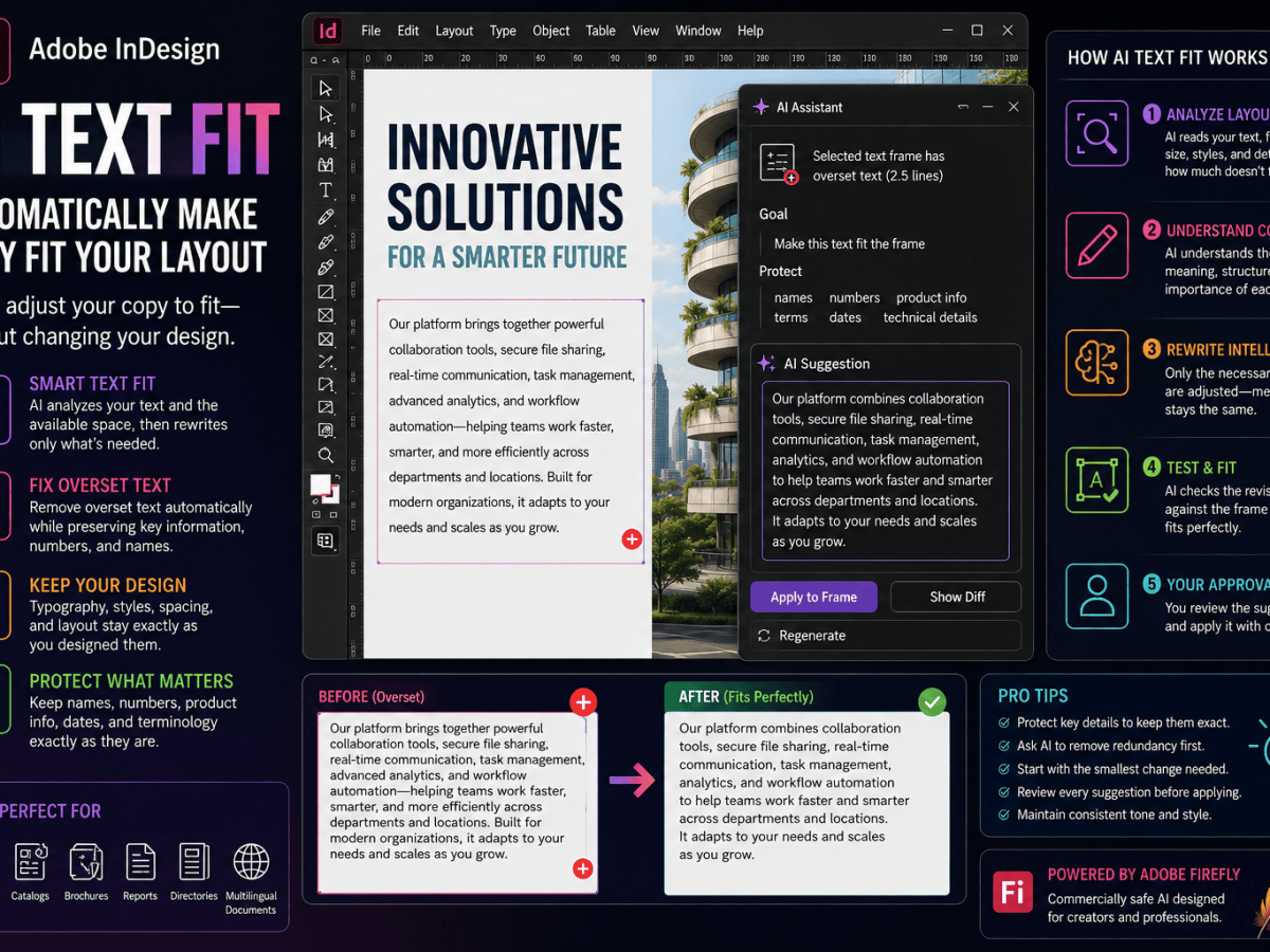
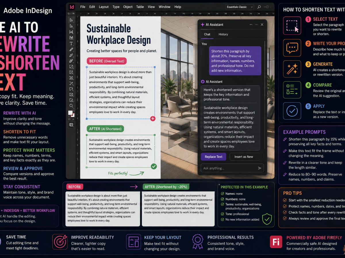
Adobe is also adding AI-assisted writing capabilities to InDesign.
Designers can increasingly generate or rewrite content directly in the application.
That creates another source of variable text length.
Suppose AI generates three versions of a product description.
Version 1 contains 45 words.
Version 2 contains 68.
Version 3 contains 83.
A fixed layout may work with only one.
A flexible component can respond more intelligently to all three.
This makes Flex Layout particularly relevant to the emerging AI-assisted InDesign workflow.
Flex Layout and Accessibility
Responsive layouts can also support better accessibility.
Some readers need substantially larger text.
Digital publications that depend on rigid dimensions may struggle when text is enlarged.
Flexible design principles encourage layouts that respond to changing content dimensions.
That doesn’t automatically make a document accessible.
But the underlying philosophy is useful:
Content should be able to adapt without breaking the experience.
This becomes particularly important for digital publishing and EPUB.
Flex Layout and Reflowable EPUB Are Different
It’s important not to confuse Flex Layout with EPUB reflow.
They are different technologies and workflows.
Flex Layout controls relationships between objects inside InDesign.
Reflowable EPUB converts document content into a flexible digital reading experience based largely on HTML and CSS.
However, both encourage similar thinking.
Instead of assuming one fixed page state, you design for content that may change.
Learning Flex Layout can therefore help print-oriented designers become more comfortable with responsive design concepts.
When Should You Use Flex Layout?
Flex Layout is particularly useful when:
- content length varies
- components are reused
- templates contain variable data
- documents are translated
- content is generated automatically
- objects need consistent spacing
- layouts need to adapt to different dimensions
Good candidates include:
- product cards
- profile cards
- callouts
- feature boxes
- statistic panels
- information modules
- reusable template components
When Should You Keep Using Fixed Layout?
Not everything should become flexible.
Traditional positioning remains ideal when the exact composition is important.
Examples include:
- magazine covers
- posters
- advertisements
- highly art-directed spreads
- packaging
- exhibition graphics
If you know exactly what content will appear and exact positioning is part of the visual concept, fixed layout may be the better solution.
Flex Layout is another tool—not a replacement for everything InDesign already does well.
Use a Hybrid Approach
In many documents, the best solution will be hybrid.
For example:
Page grid: fixed.
Hero image: fixed.
Main article: traditional threaded text.
Sidebar: Flex Layout.
Author card: Flex Layout.
Footer: fixed.
This gives you precision where you need it and adaptability where it provides value.
Common Beginner Mistake: Too Much Flexibility
It can be tempting to make everything flexible simply because the feature is new.
Don’t.
Every flexible relationship adds behavior that you need to understand.
Use Flex Layout when it solves a genuine problem.
Ask:
Is this content likely to vary?
If the answer is no, a traditional layout may be simpler.
Common Beginner Mistake: Ignoring Edge Cases
Suppose your product card looks perfect with:
Office Chair
Don’t stop there.
Test:
Professional Ergonomic Executive Office Chair with Adjustable Lumbar Support
If the design immediately breaks, the component isn’t robust.
Also test:
- very short text
- very long text
- missing content
- unusual images
- translated text
Flex Layout should be tested against variation.
Common Beginner Mistake: Forgetting Typography
A flexible layout can adapt perfectly while still producing poor typography.
Watch for:
- awkward headline wrapping
- widows
- excessive line lengths
- poor paragraph spacing
- unbalanced text blocks
Flex Layout controls layout relationships.
You remain responsible for typography.
Common Beginner Mistake: Expecting Magic
Flex Layout isn’t an “automatically make this design responsive” button.
You still need to define the rules.
You need to decide:
- direction
- spacing
- alignment
- wrapping
- sizing
- constraints
The quality of the flexible layout depends on the quality of those decisions.
A Simple Learning Exercise
If you’re completely new to Flex Layout, try this 20-minute exercise.
Step 1
Create three text frames:
Heading
Description
Button
Step 2
Arrange them vertically.
Step 3
Create a Flex Layout container.
Step 4
Set the layout to a vertical direction.
Step 5
Add consistent spacing.
Step 6
Experiment with alignment.
Step 7
Double the heading length.
Step 8
Triple the description length.
Step 9
Resize the container.
Step 10
Observe what changes automatically and what still requires adjustment.
Once you understand this simple example, move on to product cards or profile components.
Flex Layout Is Really About Design Systems
The deeper you go, the clearer this becomes.
Flex Layout isn’t merely a convenient way to arrange several objects.
It encourages designers to think systematically.
Instead of designing one product card, you’re designing:
the rules that define every product card.
Instead of designing one employee profile, you’re designing:
the system that can display any employee profile.
This is how modern interface and web design already work.
InDesign is bringing more of that thinking into professional publishing.
From Designing Pages to Designing Rules
Traditional page design asks:
What should this page look like?
Flex Layout introduces another question:
What rules should keep this page working when the content changes?
Both questions matter.
The first is about composition.
The second is about resilience.
As publishing becomes more automated, personalized, multilingual, accessible, and AI-assisted, resilience becomes increasingly important.
What to Learn After Flex Layout
Once you’re comfortable with the fundamentals, explore how Flex Layout interacts with other InDesign capabilities.
A useful learning path is:
1. Flex Layout basics
Containers, items, direction, alignment, spacing, and wrapping.
2. Auto-sizing text frames
Let text frames respond to content.
3. Paragraph and object styles
Create reusable visual systems.
4. Data Merge
Populate templates with variable information.
5. InDesign scripting
Automate repetitive publishing operations.
6. Multilingual workflows
Test flexible components against translated content.
7. AI-assisted writing
Explore how generated and rewritten text behaves inside adaptable layouts.
Together, these tools can create sophisticated automated publishing workflows.
Flex Layout and the Future of InDesign
Flex Layout may seem like a relatively specialized feature today.
But it reflects a larger change in InDesign.
Adobe is simultaneously developing capabilities around:
- responsive layout
- generative AI
- accessibility
- digital publishing
- automation
- Adobe Express integration
These areas increasingly overlap.
AI creates variable content.
Automation inserts variable data.
Translation changes text length.
Accessibility requires adaptability.
Digital publishing needs responsive behavior.
Flex Layout helps InDesign deal with that variability.
That makes it strategically important.
Final Thoughts
Adobe InDesign Flex Layout introduces a new way of thinking about page composition.
Traditional InDesign layout is based heavily on coordinates:
Put this object here.
Make it this size.
Place the next object there.
Flex Layout adds another approach:
Keep these objects together.
Arrange them in this direction.
Maintain this spacing.
Align them this way.
Adapt when the content changes.
Neither approach is universally better.
The skill is knowing which one to use.
For a carefully art-directed magazine cover, fixed positioning may be exactly what you want.
For 500 product cards containing unpredictable descriptions, Flex Layout may save enormous amounts of production time.
If you’re new to the feature, don’t start with a complicated document.
Create one simple card.
Add a heading, paragraph, and button.
Turn it into a Flex Layout.
Then change the content.
Make the heading longer.
Make the paragraph shorter.
Resize the container.
Watch what happens.
Once you see objects responding to relationships instead of just coordinates, the purpose of Flex Layout becomes much easier to understand.
And that idea—designing rules rather than only designing positions—is likely to become increasingly important as Adobe InDesign continues evolving toward more responsive, automated, accessible, and AI-assisted publishing.

 IndesignPerfect