Adobe InDesign has always been built around precision.
For decades, designers have relied on traditional text frames, image frames, groups, and guides to build everything from business cards and brochures to magazines and books. Every object could be positioned exactly where it was needed, creating pixel-perfect layouts for print and digital publishing.
With the introduction of Flex Layout, Adobe has added a different approach.
Instead of positioning every object independently, Flex Layout allows related objects to behave as a system. Components can automatically adapt when content changes, reducing manual adjustments and making templates more resilient.
So which approach should you use?
The answer isn’t that Flex Layout replaces traditional frames.
It doesn’t.
Professional InDesign workflows will increasingly combine both approaches, using each where it offers the greatest advantage.
In this guide, we’ll compare Flex Layout and traditional frames, explain their strengths and weaknesses, and help you decide when each is the right choice.
Understanding Traditional Frames
Since the first versions of Adobe InDesign, page design has revolved around individual objects.
These include:
- Text Frames
- Graphic Frames
- Shapes
- Tables
- Groups
- Anchored Objects
Each object has its own position, size, and formatting.
You decide exactly where it sits on the page.
For example:
A heading appears at the top.
The image is placed beneath it.
The paragraph begins 10 mm lower.
A button is positioned under the paragraph.
Everything is manually controlled.
This gives designers exceptional precision.
Understanding Flex Layout
Flex Layout introduces another layer of intelligence.
Instead of treating every object independently, Flex Layout lets objects belong to a responsive container.
The designer defines rules such as:
- direction
- spacing
- alignment
- wrapping
- distribution
- resizing behavior
Rather than saying:
Put this paragraph at Y = 42 mm
you effectively say:
Keep this paragraph below the heading with consistent spacing.
The relationship becomes more important than the coordinate.
The Biggest Difference
Traditional Frames answer one question:
Where should every object go?
Flex Layout answers a different question:
How should these objects behave together?
That single difference changes how templates respond to changing content.
Traditional Frames Are Perfect for Print
Traditional layouts remain unbeatable for projects where the final dimensions never change.
Examples include:
- Books
- Magazines
- Posters
- Packaging
- Flyers
- Business Cards
- Exhibition Graphics
- Newspapers
In these projects every millimetre matters.
The designer intentionally positions every element.
Nothing is expected to move automatically.
That is exactly what traditional frames excel at.
Flex Layout Excels at Variable Content
Flex Layout shines when content isn’t predictable.
Imagine a product catalogue.
Every product contains:
- image
- product name
- description
- price
- specifications
One product name contains two words.
Another contains twelve.
One description contains 30 words.
Another contains 90.
A traditional template often requires manual adjustments.
A Flex Layout component adapts much more gracefully.
Comparing Both Approaches
| Feature | Traditional Frames | Flex Layout |
|---|---|---|
| Precise positioning | Excellent | Good |
| Variable content | Limited | Excellent |
| Automation | Moderate | Excellent |
| Reusable templates | Good | Excellent |
| Catalog production | Moderate | Excellent |
| Multilingual layouts | Moderate | Excellent |
| Print layouts | Excellent | Excellent |
| Responsive content | Limited | Excellent |
| Learning curve | Easy | Moderate |
Neither approach is universally better.
Each solves different problems.
Working with Headlines
Imagine a product card.
Traditional layout:
The heading occupies one line.
Everything below is positioned manually.
Now change the heading.
Instead of:
Office Chair
you now have:
Premium Ergonomic Executive Office Chair
The heading grows.
The description may overlap.
The price moves.
Manual correction becomes necessary.
With Flex Layout:
The heading becomes taller.
Everything below automatically follows.
The component remains organised.
Working with Images
Traditional frames work extremely well when images remain consistent.
Magazine photography is a good example.
The designer crops every photograph individually.
Every composition is intentional.
Flex Layout becomes useful when image proportions vary.
For example:
- staff photos
- product photography
- property listings
- inventory images
The layout can respond more intelligently.
Product Cards
This is probably the strongest example.
Traditional card:
Image
Heading
Description
Price
Button
If the description becomes longer:
Everything underneath requires adjustment.
Flex Layout:
The card expands naturally.
Spacing remains consistent.
The button stays beneath the description.
This dramatically reduces repetitive production work.
Team Profile Pages
Suppose you create employee profiles.
Each contains:
- photo
- name
- title
- biography
One biography:
25 words.
Another:
110 words.
Traditional positioning requires editing every card.
Flex Layout lets the cards adapt.
Annual Reports
Corporate reports contain many repeated components:
- KPI cards
- executive profiles
- statistics
- feature panels
- callout boxes
Traditional positioning works.
But Flex Layout often reduces maintenance as content evolves.
Multilingual Documents
Translation creates unpredictable layouts.
German headings become longer.
French paragraphs expand.
Dutch buttons contain more characters.
Traditional layouts require correction.
Flex Layout absorbs much of that expansion.
That makes localization much easier.
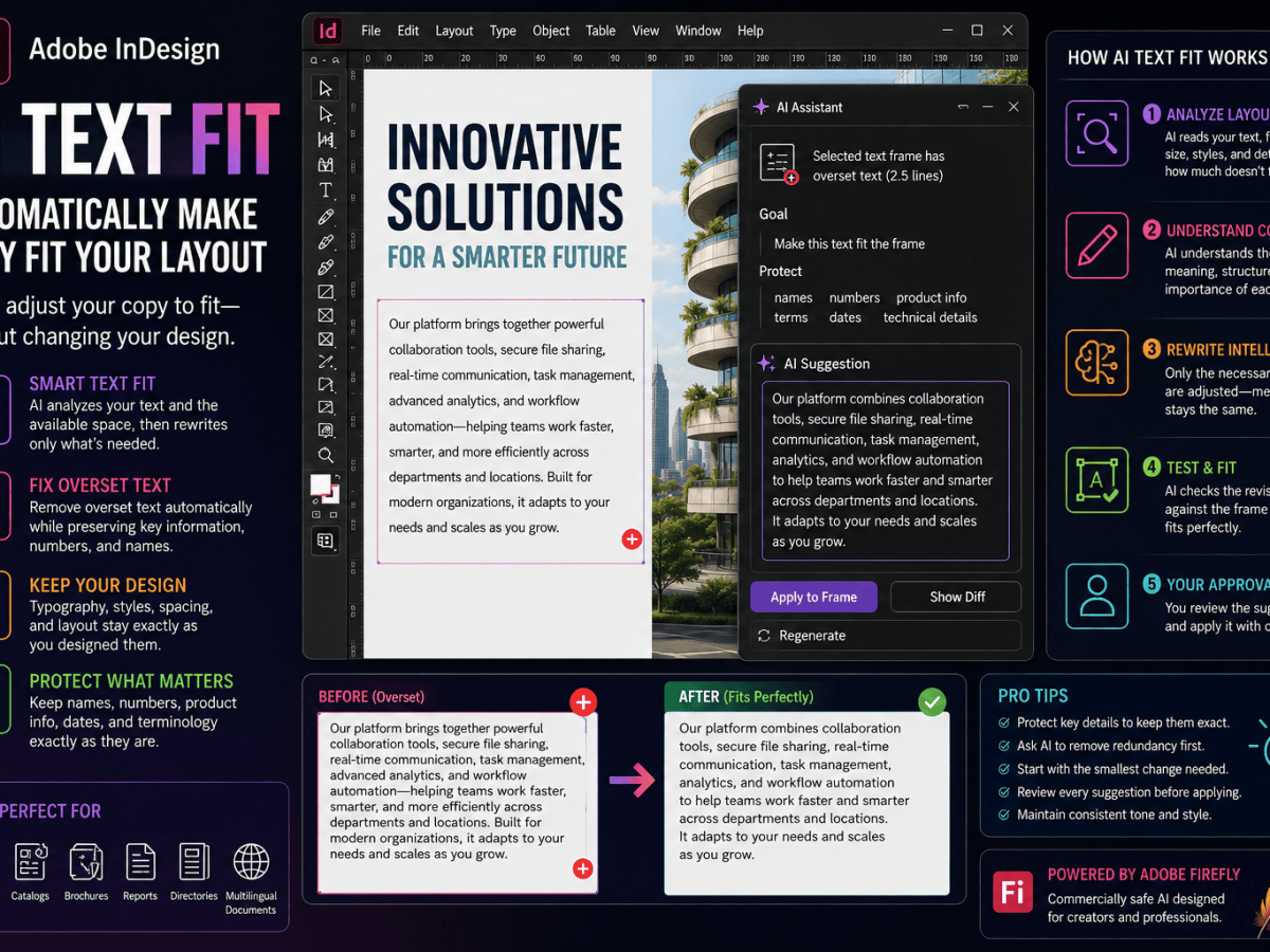
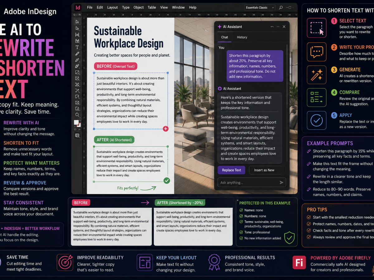
AI-Generated Content
Adobe now includes AI-assisted writing tools such as:
- Generate Text
- Rewrite
- Fit Text
AI-generated content is naturally variable.
Two generated descriptions rarely contain exactly the same number of words.
Traditional layouts are rigid.
Flex Layout handles variability much better.
As AI becomes more integrated into InDesign, Flex Layout becomes increasingly valuable.
Data Merge
Many organisations generate documents automatically.
Examples include:
- price lists
- certificates
- labels
- catalogues
- directories
Data Merge inserts unpredictable content.
Traditional templates often require manual correction afterwards.
Flex Layout makes automated publishing more robust.
Accessibility
Accessibility encourages layouts that can adapt.
Readers may enlarge text.
Different export formats may reflow content.
Rigid layouts sometimes struggle.
Flex Layout supports a more adaptive philosophy.
Although it doesn’t automatically make documents accessible, it complements accessible publishing very well.
EPUB Publishing
Traditional print thinking assumes fixed pages.
Reflowable EPUB works differently.
Readers change:
- font size
- orientation
- margins
- line spacing
Flex Layout shares a similar philosophy.
Content should adapt instead of breaking.
Reusable Components
Modern design increasingly uses reusable modules.
Examples include:
- author boxes
- testimonials
- callouts
- feature panels
- pricing tables
- product cards
Traditional frames create one instance.
Flex Layout creates a reusable system.
This is closer to modern web design and design systems.
Precision vs Adaptability
This is perhaps the most important comparison.
Traditional Frames prioritise:
- precision
- control
- exact positioning
- editorial composition
Flex Layout prioritises:
- adaptability
- relationships
- automation
- scalability
Neither philosophy replaces the other.
Professional designers need both.
Performance
For simple documents there is little practical difference.
Large automated publications, however, benefit from layouts that require fewer manual corrections.
Less repetitive editing often means:
- faster production
- fewer mistakes
- easier updates
- better consistency
Learning Curve
Traditional frames are familiar to almost every InDesign user.
Flex Layout requires learning new concepts.
These include:
- containers
- direction
- spacing rules
- alignment
- wrapping
- layout relationships
Fortunately, once you understand the core principles, Flex Layout becomes surprisingly intuitive.
When Traditional Frames Are Better
Choose traditional frames when:
- designing books
- creating magazine spreads
- producing posters
- building advertisements
- designing packaging
- controlling exact compositions
- every object must stay fixed
This remains the heart of professional print design.
When Flex Layout Is Better
Choose Flex Layout when:
- creating templates
- building product cards
- designing reusable components
- handling multilingual content
- working with AI-generated copy
- automating catalogues
- using Data Merge
- creating digital-first publications
- building responsive layouts
This is where Flex Layout delivers its greatest benefits.
Why Most Designers Should Use Both
The best solution is rarely choosing one over the other.
Instead, combine them.
For example:
Fixed page grid.
↓
Traditional hero image.
↓
Traditional article layout.
↓
Flex Layout sidebar.
↓
Flex Layout author profile.
↓
Traditional footer.
This hybrid approach combines precision with flexibility.
Common Mistakes
Making Everything Flexible
Not every object benefits from Flex Layout.
Sometimes exact positioning is the better design decision.
Ignoring Typography
Flex Layout controls relationships.
It does not replace good typography.
Paragraph styles remain essential.
Testing Only Perfect Content
Always test:
- long headings
- short headings
- long descriptions
- translated text
- different images
A flexible component should survive realistic content.
Forgetting Object Styles
Combine Flex Layout with:
- Paragraph Styles
- Character Styles
- Object Styles
Together they create a powerful design system.
The Future of InDesign
Adobe’s recent development direction is clear.
The company is investing heavily in:
- AI
- Accessibility
- Responsive Design
- EPUB
- Automation
- Flexible Components
Flex Layout fits naturally into this vision.
As publishing becomes more dynamic, responsive layouts will become increasingly important.
Traditional frames will remain fundamental.
But Flex Layout represents the next evolution of professional page design.
Which One Should You Choose?
If your project is a carefully art-directed print publication where every element has a precise position, traditional frames remain the obvious choice.
If your project contains variable content, reusable templates, multilingual copy, automated publishing, AI-generated text, or responsive digital workflows, Flex Layout can save significant production time.
Most professional designers won’t choose one or the other.
They’ll combine them.
Traditional frames provide the precision.
Flex Layout provides the adaptability.
Together they create a publishing workflow that is both beautifully designed and far more resilient to change.
Final Thoughts
Adobe InDesign isn’t abandoning traditional page design.
Instead, it’s expanding what professional layout can do.
Traditional frames remain one of the most powerful tools for fixed-page publishing.
Flex Layout introduces a complementary way of working—one that focuses on relationships rather than absolute coordinates.
As AI, automation, multilingual publishing, accessibility, and responsive digital content become increasingly common, designers will need layouts that can evolve with their content.
The strongest InDesign workflows in 2026 aren’t built on choosing between Flex Layout and traditional frames.
They’re built on knowing when to use each one.
Master traditional layout first.
Learn Flex Layout next.
Then combine them to create smarter, more adaptable, and future-ready InDesign documents.