Adobe InDesign has spent most of its life mastering one fundamental idea:
The designer controls the page.
You define the page dimensions.
You position a headline precisely.
You place an image at exact coordinates.
You determine the width of every column, the spacing between objects, and where every element appears.
That level of control is one of the reasons InDesign became the industry standard for professional page layout.
But digital publishing introduces a different requirement.
Sometimes the layout needs to adapt.
Content changes length. Text frames grow. Images use different proportions. Publications need to work across multiple dimensions and formats. A design that works perfectly at one size may become difficult to maintain when the content or available space changes.
Adobe’s answer is Flex Layout.
Flex Layout introduces a more responsive approach to arranging objects in InDesign. Instead of positioning every element independently, designers can create relationships between objects and allow the layout to respond more intelligently when content or dimensions change.
For longtime InDesign users, this represents more than another layout feature.
It introduces a different way of thinking about page design.
What Is Flex Layout in Adobe InDesign?
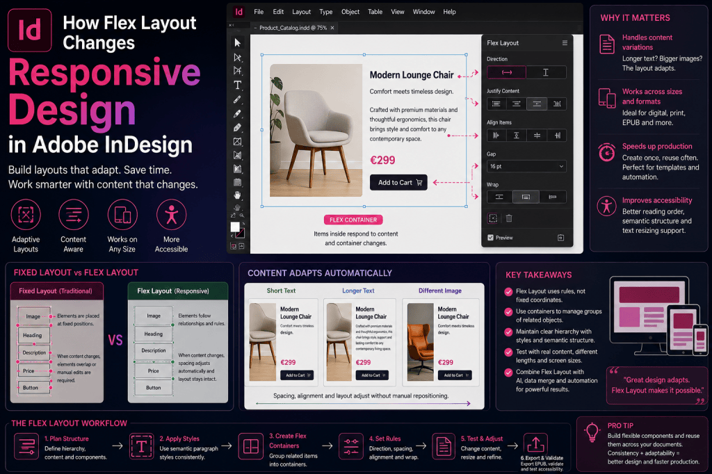
Flex Layout is a layout system designed to make groups of objects more adaptable.
Traditionally, InDesign objects are positioned using fixed coordinates.
A text frame might begin 25 mm from the left edge of the page and be exactly 80 mm wide.
An image might sit 6 mm below that text frame.
Those values remain fixed unless the designer changes them.
Flex Layout introduces relationships between objects.
Instead of thinking only in terms of exact coordinates, you can begin thinking in terms such as:
- direction
- spacing
- alignment
- distribution
- wrapping
- resizing
- relationships between objects
If you have experience with web development, the concept may sound familiar.
It is similar in principle to CSS Flexbox, where items are arranged within a container according to rules rather than every item being positioned manually.
Adobe has adapted that kind of responsive thinking to the InDesign environment.
Why Does InDesign Need Responsive Layout?
For traditional print design, fixed positioning works extremely well.
An A4 page is always A4.
A printed magazine spread doesn’t suddenly become narrower because someone opens it on a smaller screen.
The designer knows the final dimensions.
Digital content is different.
Content may need to adapt to:
- different screen sizes
- changing text lengths
- alternative images
- different languages
- changing page dimensions
- reusable templates
- multiple content variations
Even print workflows can benefit from more adaptive behavior.
Consider a product catalog template.
Every product contains:
- product name
- image
- description
- specifications
- price
- call-to-action information
Some product names contain two words.
Others contain ten.
Some descriptions contain 50 words.
Others contain 100.
A completely fixed layout can require constant manual adjustment.
A more flexible layout can respond to those variations.
The Traditional InDesign Approach
Imagine a simple promotional card containing:
Product image
Product name
Description
Price
Button or call to action
In a traditional InDesign workflow, each element might be positioned separately.
The designer manually defines the vertical spacing between the product name and description.
Then between the description and price.
Then between the price and call to action.
Everything looks perfect.
Until the product name becomes two lines instead of one.
Now the description moves too close to the heading.
Or perhaps it overlaps.
The designer manually adjusts the layout.
Then another product has a description twice as long.
Another adjustment is required.
This is manageable for five products.
For 500 products, it becomes a production problem.
Flex Layout Changes the Relationship Between Objects
Flex Layout allows those elements to behave more like a coordinated system.
Instead of saying:
Place the description at this exact Y coordinate
you can effectively think:
Place the description after the heading with this amount of spacing.
The difference is subtle but powerful.
The first instruction describes a position.
The second describes a relationship.
Responsive design is largely about relationships.
Containers Become More Important
A central concept in Flex Layout is the container.
Think of the container as the area responsible for organizing a collection of objects.
For example, you might have a Flex Layout container holding:
- icon
- headline
- description
- button
The container determines how those elements relate to each other.
Rather than adjusting each item individually, you can modify the behavior of the container.
This introduces a more systematic approach to layout.
Direction: Row or Column
One of the fundamental decisions is the direction in which items should flow.
A row arrangement places objects horizontally.
For example:
Icon | Heading | Button
A column arrangement places objects vertically.
For example:
Heading
Image
Description
Button
This may seem basic, but it establishes the primary logic of the component.
Instead of four independent objects, you now have four objects participating in a layout system.
Spacing Becomes a Rule
Spacing is one of the clearest examples of why Flex Layout matters.
Suppose you want 12 points of space between several elements.
Traditionally, you may position each object manually.
With a flexible system, spacing can become a property of the layout.
That means the relationship remains consistent even when individual objects change size.
This is extremely valuable for reusable components.
Alignment Becomes More Systematic
Flex Layout also makes alignment part of the container behavior.
Objects can be aligned according to consistent rules rather than being individually positioned.
Depending on the layout, you may want elements aligned:
- to the start
- to the center
- to the end
- according to available space
This makes it easier to maintain visual consistency when the contents of individual objects change.
Responsive Design Is About Rules, Not Coordinates
This is perhaps the biggest conceptual shift.
Traditional InDesign asks:
Where should this object go?
Responsive layout asks:
How should this object behave?
That is a very different design question.
For example:
Traditional:
Position this button 185 mm from the top of the page.
Responsive:
Keep this button below the description with consistent spacing.
The second rule is much more resilient when the description changes.
Flex Layout and Auto-Sizing Text
Flex Layout becomes particularly interesting when combined with text frames that can adapt to their content.
Imagine a heading frame that grows vertically when the heading becomes longer.
If the elements below it are positioned using fixed coordinates, the expanding heading can create overlap.
But if those elements participate in a flexible layout, the rest of the component can respond to the change.
This combination makes content-driven layout much more practical.
Flex Layout and Catalog Production
Catalogs may become one of the strongest professional use cases.
Suppose you have 1,000 products.
Each product card contains:
Image
Product Name
Description
Specifications
Price
The content comes from a database.
You cannot guarantee that every description has exactly the same length.
Traditionally, this variation creates layout exceptions.
With flexible layout principles, templates can become more tolerant of content differences.
This could make Flex Layout increasingly valuable alongside:
- Data Merge
- XML workflows
- scripting
- database publishing
- automated catalog systems
The more automated the publishing workflow becomes, the more valuable adaptable layouts become.
Flex Layout and Multilingual Publishing
Multilingual publishing presents another obvious application.
Translated text rarely occupies exactly the same amount of space as the source language.
An English heading might read:
Product Support
The German equivalent could require substantially more horizontal space.
A French paragraph might occupy additional lines.
A Dutch button label may be longer than its English counterpart.
Fixed layouts often require manual correction after translation.
Flexible layouts can potentially absorb some of those differences automatically.
This doesn’t eliminate localization work.
But it can make templates much more robust.
Flex Layout and AI-Generated Text
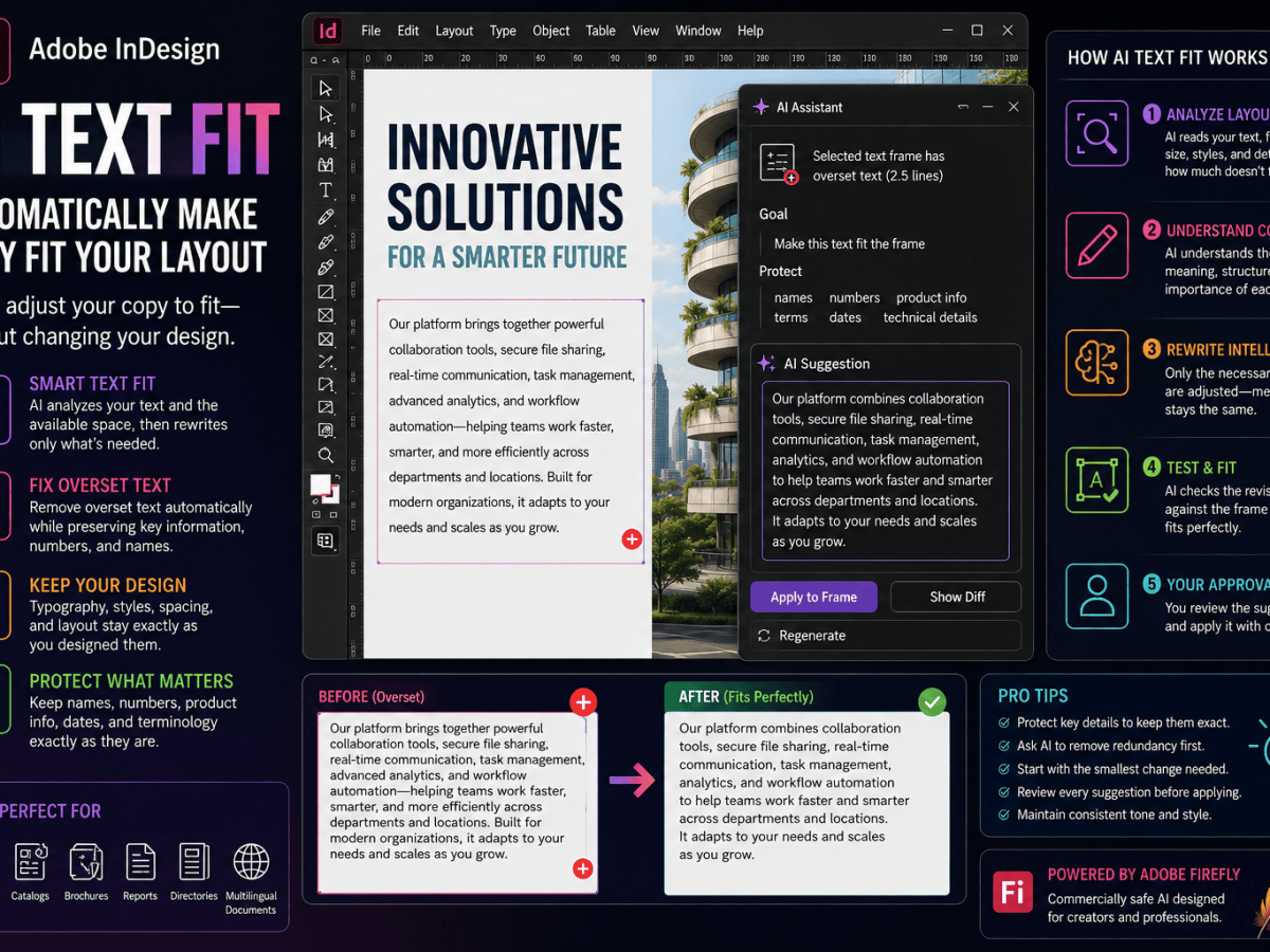
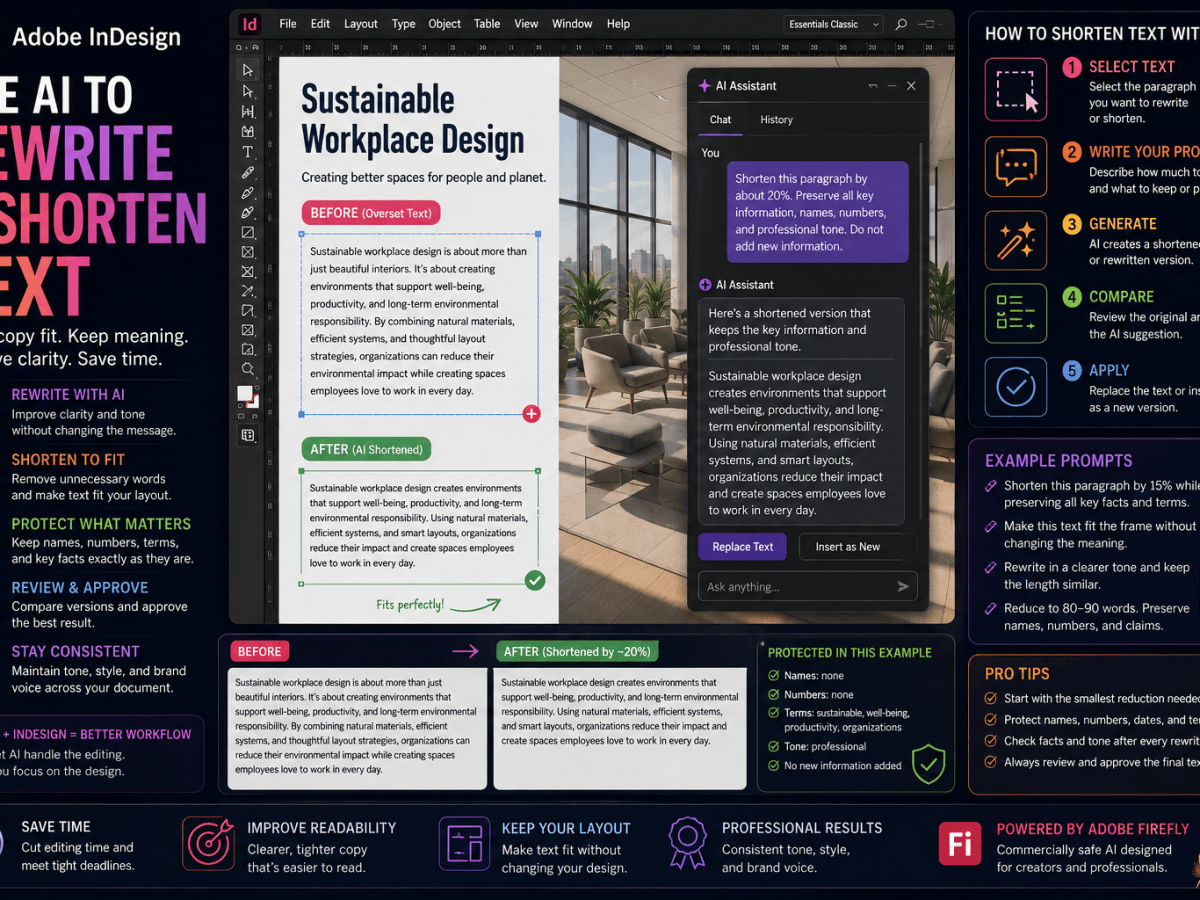
Flex Layout becomes even more interesting when combined with Adobe’s growing AI capabilities.
InDesign can increasingly help designers:
- generate text
- rewrite text
- shorten content
- expand content
- fit text to available space
Generated content is inherently variable.
One AI-generated description might contain 55 words.
Another might contain 72.
A rigid template may struggle with those differences.
Flexible layouts are much better suited to variable content.
This creates an important relationship:
AI makes content more dynamic.
Flex Layout makes layouts more dynamic.
Together, they point toward a more adaptive InDesign workflow.
Flex Layout and Modular Design
Modern digital design increasingly relies on components.
Instead of designing every page as a unique composition, designers build reusable modules such as:
- cards
- callouts
- hero sections
- product blocks
- feature lists
- author boxes
- statistics panels
- quote components
Flex Layout fits naturally into this approach.
Each component can contain its own internal layout rules.
The component can then be reused with different content.
This is much closer to how modern design systems work.
Think in Components Instead of Pages
Traditional publication design often begins with the page.
You ask:
What should page 12 look like?
A component-based approach asks:
Which reusable content modules belong on page 12?
That difference becomes increasingly important when the same content needs to appear across many formats.
For example, a product component might appear in:
- catalog
- brochure
- sales sheet
- digital publication
- regional edition
If the component contains intelligent layout behavior, reuse becomes easier.
Flex Layout Doesn’t Eliminate Grids
Responsive layout does not mean abandoning traditional grid systems.
Grids remain essential for:
- hierarchy
- rhythm
- alignment
- consistency
- composition
Flex Layout operates at another level.
A page may still use a carefully designed twelve-column grid.
Within that grid, individual components may use flexible internal layouts.
Think of it as:
Grid = overall page structure
Flex Layout = relationships inside components
The two approaches can complement each other.
Flex Layout Doesn’t Mean Everything Should Move
Another misconception is that responsive design means allowing everything to move freely.
Good responsive design still has constraints.
You may want:
- fixed image proportions
- minimum widths
- maximum widths
- consistent spacing
- specific alignment
- controlled wrapping
Flexibility works best when it is bounded by design rules.
The objective isn’t randomness.
The objective is controlled adaptation.
A Practical Example: Feature Card
Imagine a feature card containing an icon, heading, description, and link.
Traditional approach
You manually position:
Icon at Y = 0
Heading at Y = 40
Description at Y = 70
Link at Y = 150
This works until the heading wraps onto two lines.
Now the description may collide with it.
Flex approach
The elements are arranged vertically with defined spacing.
The heading becomes taller.
The description automatically follows.
The link remains appropriately spaced below the description.
The design rule survives the content change.
That is the fundamental value of flexible layout.
A Practical Example: Team Member Cards
Suppose you’re creating an annual report containing employee profiles.
Each profile includes:
- photograph
- name
- job title
- biography
- contact information
One biography contains 45 words.
Another contains 90.
Traditional fixed cards may become inconsistent or require manual editing.
Flexible cards can adapt their internal structure to different amounts of content.
The overall design remains systematic even though the content varies.
A Practical Example: Dashboard-Style Reports
Modern corporate reports increasingly include dashboard-like components:
- KPI cards
- statistics
- icons
- labels
- trend indicators
These components are excellent candidates for flexible layout.
For example, a KPI component might contain:
€12.4M
Annual Revenue
+18%
If another KPI has a longer label, the layout should adapt without requiring manual repositioning.
This is exactly the kind of problem Flex Layout is designed to address.
Flex Layout Makes Templates Smarter
Traditional InDesign templates often provide visual starting points.
A Flex Layout template can potentially provide behavior as well.
Instead of merely saying:
Put the heading here.
the template can say:
The heading belongs after this object, aligns this way, and maintains this spacing relationship.
That makes templates more resilient.
The template isn’t simply storing coordinates.
It is storing layout logic.
This Matters for Automation
Automation works best when templates can tolerate variation.
If a script inserts content into a rigid layout, unexpected text length may break the page.
The automation then requires many exception-handling rules.
Flexible layouts can potentially reduce those exceptions.
This could make InDesign automation more reliable for:
- catalogs
- directories
- price lists
- reports
- personalized publications
- localized documents
Responsive behavior is therefore not only a design feature.
It can also become an automation feature.
Flex Layout and EPUB
Flex Layout also fits naturally with Adobe’s increasing focus on digital publishing.
Reflowable EPUB already requires designers to think differently from print.
Readers can change:
- font size
- display dimensions
- orientation
- reading settings
Content cannot depend entirely on fixed coordinates.
Although InDesign’s EPUB output and Flex Layout are distinct parts of the application, the underlying philosophy is similar:
design for adaptation rather than one immutable page state.
This mindset is increasingly important for modern publishing.
Flex Layout and Accessibility
Responsive design also has accessibility implications.
Readers with low vision may substantially enlarge text.
Rigid layouts can fail when this happens.
Content may become:
- clipped
- overlapped
- hidden
- difficult to navigate
Layouts designed with adaptability in mind are more resilient.
Adobe’s recent work on Flex Layout and improved EPUB text resizing therefore reflects a broader movement toward content that can respond to the reader.
Accessibility and responsive design are becoming increasingly connected.
InDesign 21.4 Makes Flex Layout Easier to Work With
Adobe continued improving Flex Layout in InDesign 21.4.
One area of refinement is the editing experience itself.
Working with objects nested inside flexible containers can potentially become confusing because the designer needs to distinguish between selecting the container and selecting an individual object within it.
Adobe has been improving the interaction model to make selecting and editing Flex Layout items more intuitive.
This matters because sophisticated layout systems only become useful if designers can manipulate them efficiently.
Flex Layout is still an evolving capability, and Adobe’s continued investment suggests it is becoming an increasingly important part of InDesign’s future.
Flex Layout Requires a Different Mental Model
Longtime InDesign users may initially find flexible layout uncomfortable.
That’s understandable.
For years, precision has meant:
exact coordinates
exact dimensions
exact positions
Flex Layout introduces another type of precision:
exact relationships
Instead of controlling where every object sits, you control the rules that determine where objects sit.
Web designers went through a similar transition.
Responsive web design required moving away from pixel-perfect layouts designed for one screen size toward systems that could adapt.
InDesign designers are beginning to encounter a similar idea.
Fixed Layout Is Not Going Away
Flex Layout does not make traditional InDesign layout obsolete.
There are countless situations where exact positioning remains the correct approach.
Examples include:
- books
- posters
- packaging
- print advertisements
- magazines
- exhibition graphics
- highly art-directed spreads
If the final dimensions are known and the composition needs precise control, fixed layout remains extremely powerful.
Flex Layout simply adds another option.
The question becomes:
Which parts of this design should be fixed, and which parts should adapt?
That is a much more useful way to think about it.
Hybrid Layouts May Be the Future
The most powerful InDesign documents may combine both approaches.
For example:
Page level: fixed grid.
Hero image: fixed composition.
Article body: traditional text flow.
Sidebar: Flex Layout.
Product cards: Flex Layout.
Footer: fixed.
This gives designers precision where precision matters and adaptability where content varies.
The future is unlikely to be entirely fixed or entirely flexible.
It will probably be hybrid.
How to Start Experimenting with Flex Layout
Don’t begin by rebuilding a 300-page publication.
Create a simple test document.
Build a card containing:
- icon
- heading
- description
- button
Convert the group into a Flex Layout.
Experiment with:
- horizontal and vertical direction
- spacing
- alignment
- different text lengths
- different image sizes
- resizing the container
Then duplicate the card.
Change the heading.
Double the description length.
Replace the image.
Observe how the layout responds.
This teaches the core concept much faster than reading a long list of settings.
Questions to Ask When Building a Flex Layout
Before creating a flexible component, ask:
What should remain fixed?
Perhaps the icon size should never change.
What can grow?
Perhaps the description should expand vertically.
What should remain aligned?
Perhaps all buttons should align consistently.
What spacing should remain constant?
Define the relationships.
What happens when content becomes longer?
Test realistic extremes.
What happens when the container becomes smaller?
Don’t design only for the ideal case.
These questions turn Flex Layout into a design system rather than simply a software feature.
Common Mistake: Making Everything Flexible
Not every element benefits from flexible behavior.
If the design requires a precise editorial composition, introducing unnecessary flexibility can make the layout harder to control.
Use Flex Layout where variability exists.
Good candidates include:
- cards
- repeating modules
- variable-length content
- translated content
- automatically generated content
- responsive components
Poor candidates may include highly art-directed compositions where every element intentionally occupies a precise location.
Common Mistake: Testing Only Perfect Content
A responsive component shouldn’t be tested only with the ideal headline and perfect 60-word paragraph.
Try:
- one-word heading
- three-line heading
- very short description
- very long description
- missing image
- unusually wide image
- translated copy
The point of responsive design is surviving variation.
If the component only works with perfect content, it isn’t truly flexible.
Common Mistake: Ignoring Typography
Flex Layout solves spatial relationships.
It doesn’t solve poor typography.
You still need to consider:
- line length
- leading
- hierarchy
- paragraph spacing
- widows and orphans
- heading balance
A component can respond perfectly and still look terrible.
Flexibility supports design judgment.
It doesn’t replace it.
What Flex Layout Means for InDesign’s Future
Flex Layout may ultimately be more strategically important than it first appears.
Adobe is simultaneously investing in:
- generative AI
- responsive layout
- accessibility
- EPUB
- Adobe Express integration
- content automation
These developments reinforce each other.
AI creates more variable content.
Accessibility requires content to adapt to reader preferences.
Digital publishing requires responsive behavior.
Automation requires templates capable of handling unpredictable data.
Flex Layout provides part of the layout infrastructure needed to support those changes.
From Page Layout to Layout Systems
This may be the biggest conceptual shift.
Traditional InDesign expertise has focused heavily on creating pages.
Future InDesign expertise may increasingly involve creating layout systems.
A page is one finished composition.
A layout system describes how many possible compositions should behave.
That requires thinking about:
- rules
- constraints
- relationships
- components
- variations
- edge cases
This doesn’t diminish the craft of page design.
It expands it.
Why Designers Should Learn Flex Layout Now
Flex Layout is still relatively new compared with foundational InDesign tools such as paragraph styles and parent pages.
That makes now a good time to learn it.
Designers who understand the principles early will be better prepared as Adobe expands responsive capabilities.
You don’t need to convert every existing workflow.
Start with components where the advantages are obvious.
Product cards.
Sidebars.
Feature panels.
Team profiles.
Statistics blocks.
Reusable callouts.
Learn how the system behaves.
Then decide where it genuinely improves your production workflow.
Final Thoughts
Flex Layout changes Adobe InDesign because it introduces a different answer to one of the most fundamental questions in design.
Traditionally, the question has been:
Where should this object be positioned?
Flex Layout encourages designers to ask:
How should this object relate to everything around it?
That difference is the foundation of responsive design.
Fixed coordinates remain incredibly powerful.
They are one of InDesign’s greatest strengths.
But modern publishing increasingly involves content that changes.
Text gets translated.
AI generates different amounts of copy.
Database content varies.
Readers enlarge text.
Digital publications appear on different screens.
Templates need to support hundreds or thousands of content combinations.
In those situations, exact coordinates alone aren’t enough.
The layout needs rules.
Flex Layout provides InDesign designers with a way to begin defining those rules directly inside the application.
The result isn’t the end of traditional page design.
It’s an expansion of what page design can become.
The most effective InDesign workflows of the future will probably combine both approaches:
fixed when precision matters, flexible when content needs to adapt.
Learning when to use each may become one of the most important InDesign skills of the next few years.