Creating a beautiful publication is no longer enough.
Whether you’re producing a corporate report, brochure, government document, university publication, interactive PDF, or EPUB, accessibility increasingly needs to be considered from the beginning of the design process.
Adobe InDesign has long provided features that can contribute to accessible documents. Recent workflows make it increasingly practical to incorporate accessibility into everyday document production rather than treating it as something that happens only after the design has been completed.
The important change is philosophical:
Accessibility should become part of preflight.
Designers already check missing fonts, low-resolution images, overset text, broken links, bleed, and color settings before publishing.
Accessibility deserves the same treatment.
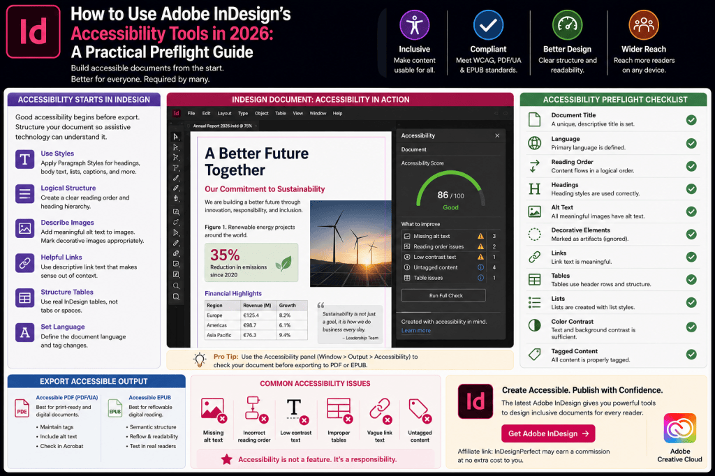
In this guide, we’ll build a practical accessibility-checking workflow for Adobe InDesign in 2026 and examine the areas you should inspect before exporting your document.
Why Accessibility Matters More in 2026
Digital documents are consumed by people using many different technologies.
Some readers use:
- screen readers
- keyboard navigation
- magnification
- high-contrast settings
- text-to-speech software
- customized EPUB reading environments
A document that looks perfect on your monitor may be extremely difficult—or impossible—for another person to use.
Accessibility therefore isn’t simply a technical export option.
It starts with document design.
Accessibility Is Becoming a Core InDesign Skill
For years, accessibility was often treated as a specialist responsibility.
The designer created the publication.
Someone else attempted to make the final PDF accessible.
That approach creates problems because many accessibility decisions originate inside the source document.
These include:
- heading structure
- reading order
- paragraph styles
- image descriptions
- table construction
- hyperlinks
- document language
- content hierarchy
If the InDesign document is poorly structured, repairing the exported PDF can become much more difficult.
Modern designers should therefore think about accessibility while building the document.
Accessibility Preflight: Think Like a Production Designer
InDesign users already understand preflight.
Before sending a publication to print, you wouldn’t deliberately ignore a missing image.
Accessibility should work similarly.
Before exporting, ask:
Does every important image have appropriate alternative text?
Is the document hierarchy logical?
Can assistive technology understand the headings?
Is the reading order correct?
Are hyperlinks meaningful?
Are tables structured properly?
Is the document language defined?
This creates an accessibility preflight mindset.
Step 1: Start with Paragraph Styles
One of the best things you can do for an accessible InDesign document is also one of the best things you can do for any professional InDesign document:
use Paragraph Styles.
Don’t manually format every heading.
Create styles such as:
- Title
- Heading 1
- Heading 2
- Heading 3
- Body
- Caption
- Quote
- List
The visual appearance is only one benefit.
Styles also provide structure that can be mapped to appropriate tags during export.
Visual Formatting Isn’t Document Structure
Consider two headings.
The first is formatted manually:
24 pt, Bold
The second uses:
Heading 1 Paragraph Style
They may look identical.
But structurally, they are not necessarily equivalent.
A human reader can recognize the first as a heading because it is large and bold.
Assistive technology benefits from explicit semantic structure.
This is why professional accessibility begins with styles rather than appearance alone.
Step 2: Create a Logical Heading Hierarchy
Headings should follow a meaningful structure.
For example:
H1 — Annual Report 2026
H2 — Financial Performance
H3 — European Operations
H3 — North American Operations
H2 — Sustainability
This structure communicates relationships between sections.
Avoid using heading levels purely because you prefer their visual appearance.
Your heading hierarchy should describe the information architecture of the document.
Don’t Skip Heading Levels Without Reason
A structure such as:
H1
↓
H4
↓
H2
may be visually acceptable but structurally confusing.
Think of headings as an outline.
The hierarchy should make sense even if all visual formatting disappeared.
That is a useful accessibility test.
Step 3: Check the Reading Order
Page layout gives designers enormous visual freedom.
You can position a headline at the top, place a sidebar on the right, insert a photograph in the middle, and put a caption beneath it.
A sighted reader can often infer the intended reading sequence.
Assistive technology may depend on the underlying document order.
That means you need to consider:
What should be read first?
Then:
What comes next?
Then:
What comes after that?
Reading order is especially important in complex layouts.
A Two-Column Example
Imagine this page:
Left column
Main article.
Right column
Sidebar.
Visually, the relationship may be obvious.
But the underlying document structure could accidentally produce:
Paragraph 1 from main article.
Sidebar heading.
Paragraph 2 from main article.
Sidebar paragraph.
Paragraph 3 from main article.
That creates a terrible reading experience.
Always inspect complex layouts carefully.
Step 4: Add Alternative Text to Meaningful Images
Images that communicate information need appropriate alternative text.
Suppose your publication contains a photograph of a new company headquarters.
Poor alt text:
Image.
Better:
Exterior of the company’s new Rotterdam headquarters.
The goal isn’t to describe every pixel.
The goal is to communicate the information a reader needs from the image.
AI Can Help Generate Alt Text
Modern InDesign workflows can use AI assistance to help create image descriptions.
This can dramatically accelerate accessibility work in image-heavy publications.
For example, AI might identify:
A group of five people sitting around a conference table.
That can provide a useful starting point.
But it still requires human review.
AI Doesn’t Know Why the Image Matters
Imagine a photograph showing five executives around a conference table.
AI may correctly describe the visible content.
But perhaps the photograph appears in an annual report because those five people are the company’s newly appointed executive board.
The better alt text might be:
Quorentra executive leadership team during the company’s 2026 strategy meeting.
Context changes the appropriate description.
AI sees pixels.
The editor understands purpose.
Use both.
Step 5: Identify Decorative Images
Not every image needs a detailed description.
Some graphics exist purely for decoration.
Examples might include:
- ornamental lines
- decorative backgrounds
- abstract shapes
- visual separators
If an image communicates no meaningful information, forcing a screen reader to describe it can actually make the document less usable.
Decorative elements should therefore be handled appropriately in the accessibility structure.
The goal isn’t maximum description.
It is meaningful description.
Step 6: Check Hyperlinks
A hyperlink should tell readers where it leads.
Poor:
Click here.
Better:
Download the 2026 Sustainability Report.
Why?
Because screen-reader users may navigate through links separately from surrounding paragraphs.
A list containing:
Click here
Click here
Learn more
Read more
provides very little context.
Meaningful link text improves navigation for everyone.
Step 7: Check Tables
Tables can be one of the most difficult components of accessible documents.
Visually, a table communicates relationships through rows and columns.
Assistive technology needs those relationships represented structurally.
For example:
| Product | Revenue | Growth |
|---|---|---|
| Product A | €4.2m | 12% |
| Product B | €2.8m | 7% |
A sighted reader immediately understands that 12% belongs to Product A.
An accessible table should preserve that relationship programmatically.
Avoid Fake Tables
Never build a table by pressing:
Tab Tab Tab Space Space Space
until the text looks aligned.
It may look like a table.
It isn’t one.
Use InDesign’s actual table functionality.
Structured content is much easier to make accessible than visually simulated structure.
Step 8: Review Lists
Lists should also be created structurally where possible.
Instead of manually typing:
- Item one
- Item two
- Item three
use InDesign’s list functionality and appropriate paragraph styles.
Again, the principle is:
Don’t merely make content look structured.
Make it structured.
Step 9: Check Document Language
Assistive technologies need to know what language they’re reading.
Pronunciation rules differ dramatically between:
- English
- Dutch
- German
- French
- Spanish
A screen reader interpreting Dutch text as English may produce confusing pronunciation.
Make sure language information is correctly defined where appropriate.
Multilingual Documents Need Extra Attention
Suppose an annual report is primarily English but contains a quotation in French.
Ideally, the language change should be represented appropriately.
The same applies to:
- bilingual brochures
- multilingual reports
- educational materials
- international catalogs
Language is part of document semantics.
Step 10: Check Color Contrast
Accessibility isn’t only about screen readers.
Low contrast can make content difficult to read for people with visual impairments.
For example:
light gray text on white
may look elegant on a high-quality monitor.
It may also be difficult to read.
Pay particular attention to:
- small body text
- captions
- colored backgrounds
- buttons
- charts
- infographics
A sophisticated design doesn’t need to sacrifice readability.
Don’t Communicate Information Through Color Alone
Imagine a financial chart where:
green = profit
and
red = loss
If color is the only distinction, some readers may struggle to interpret it.
Add another differentiator such as:
- labels
- patterns
- symbols
- line styles
This makes the information more robust.
Step 11: Check Font Size and Readability
There isn’t one magical font size that makes every document accessible.
Readability depends on:
- typeface
- x-height
- line length
- leading
- contrast
- medium
- audience
But extremely small text creates obvious accessibility problems.
Don’t solve layout problems by repeatedly shrinking typography.
This is especially relevant when dealing with overset text.
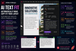
AI Text Fit Can Help Here
Modern AI-assisted text workflows can sometimes provide an alternative.
Instead of reducing body text from 10 pt to 8 pt to make a paragraph fit, you may be able to shorten unnecessarily verbose copy.
That can preserve readable typography.
The sequence becomes:
Copy doesn’t fit
↓
Review whether all wording is necessary
↓
Use AI-assisted rewriting if appropriate
↓
Human review
↓
Preserve readable type
AI isn’t an accessibility solution by itself.
But it can support better accessibility decisions.
Step 12: Check Images Containing Text
Text embedded inside images can create accessibility problems.
For example, imagine a promotional image containing:
35% Revenue Growth in 2026
A screen reader doesn’t automatically experience that text in the same way as normal document text.
Whenever important information appears inside an image, ensure that information is also communicated accessibly.
Infographics Need Special Attention
Infographics can be particularly challenging.
A complex infographic might combine:
- icons
- numbers
- charts
- arrows
- labels
- relationships
A simple one-sentence alt description may not adequately communicate the information.
You may need:
- a longer description
- accompanying body text
- accessible data tables
- structured alternatives
Accessibility sometimes requires editorial adaptation, not merely metadata.
Step 13: Check Interactive Elements
Interactive documents can contain:
- buttons
- hyperlinks
- form fields
- navigation elements
These need meaningful names and logical behavior.
A button labeled:
Button 7
isn’t useful.
A meaningful label such as:
Download Annual Report
provides context.
Step 14: Check Articles and Content Structure
For complex documents, InDesign’s Articles-related workflow can help establish meaningful content organization.
This is particularly important when the visual page order doesn’t naturally match the logical reading sequence.
Use structure intentionally.
Don’t assume export will automatically understand your design.
Step 15: Review Export Tagging
Paragraph styles can be mapped to meaningful export tags.
For example:
Title
→ appropriate heading structure
Heading 1
→ H1
Heading 2
→ H2
Body
→ paragraph
This helps preserve semantics when content leaves InDesign.
The exact export requirements depend on your target format.
Accessible PDF and EPUB Are Different
Don’t assume that one accessibility workflow automatically produces perfect results everywhere.
PDF and EPUB have different characteristics.
Often preserves a fixed visual page.
Reflowable EPUB
Allows content to adapt to the reader’s environment.
Both require semantic structure.
But they need different testing.
Step 16: Test the Exported PDF
InDesign is the source.
The PDF is the deliverable.
Always inspect the exported file.
Depending on your production environment, Adobe Acrobat’s accessibility tools can help identify issues in the final PDF.
Check areas such as:
- tags
- reading order
- document title
- language
- alternative text
- tables
- links
Don’t assume that because the InDesign file looks correct, the PDF is automatically accessible.
Step 17: Test EPUB in Real Reading Software
The same principle applies to EPUB.
Don’t only inspect the EPUB inside your production workflow.
Open it in actual reading environments.
Change:
- font size
- window size
- orientation
- display settings
Ask:
Does the content still make sense?
A reflowable publication should survive reader customization.
Flex Layout and Accessibility
Flex Layout introduces an interesting connection between responsive design and accessibility.
Traditional layouts often assume content will remain within precise dimensions.
Accessible digital content needs to tolerate variation.
Readers may enlarge text.
Translations may expand.
Content may reflow.
Flexible layout thinking can therefore support more resilient publishing systems.
Accessibility and Math Expressions
Mathematical content requires additional attention.
A beautifully rendered equation may be visually correct but inaccessible if assistive technology cannot interpret its meaning.
Modern mathematical publishing increasingly relies on structured approaches such as MathML for digital accessibility.
If you’re producing educational or scientific documents, test equations carefully in the final output.
Accessibility and AI
AI can help designers identify or solve repetitive accessibility tasks.
Potential uses include:
- alt-text suggestions
- copy simplification
- text-length adaptation
- content analysis
But AI should not be treated as an automatic accessibility certification system.
Human judgment remains essential.
Build an Accessibility Preflight Checklist
Before exporting an important publication, check:
- Paragraph Styles are used consistently.
- Heading hierarchy is logical.
- Reading order makes sense.
- Meaningful images have alt text.
- Decorative images are handled appropriately.
- Links use meaningful descriptions.
- Tables have proper structure.
- Lists are actual lists.
- Language is correctly defined.
- Color contrast is sufficient.
- Information isn’t communicated through color alone.
- Typography remains readable.
- Important text isn’t trapped inside images.
- Interactive elements have meaningful names.
- Export tagging is appropriate.
- PDF or EPUB output has been tested.
This should become as normal as checking for missing fonts.
Add Accessibility to Your InDesign Preflight Routine
A professional publishing workflow might look like this:
Design Preflight
Check grids, typography, spacing, imagery.
↓
Technical Preflight
Check missing links, fonts, resolution, overset text.
↓
Accessibility Preflight
Check structure, alt text, reading order, language, tables, links.
↓
Export
Generate PDF or EPUB.
↓
Output Validation
Test the actual deliverable.
Accessibility becomes part of production rather than an afterthought.
Where AI Can Save Time
Imagine an annual report containing:
220 pages
380 photographs
65 charts
40 tables
Manually inspecting everything requires substantial effort.
AI can help with repetitive first-pass tasks such as generating draft alt text.
But the correct model is:
AI generates
↓
Human reviews
↓
Designer corrects
↓
Output is tested
not:
AI generates
↓
Publish immediately
Efficiency shouldn’t eliminate quality control.
Accessibility Can Improve Design for Everyone
Many accessibility improvements benefit users without disabilities too.
Clear headings improve scanning.
Good contrast improves readability.
Meaningful links improve navigation.
Logical document structure improves comprehension.
Readable typography reduces fatigue.
Responsive EPUBs work better across devices.
Accessibility and good design frequently reinforce each other.
Common Accessibility Mistake #1: Fixing Everything in Acrobat
Acrobat can be extremely useful for checking and remediating accessible PDFs.
But relying on Acrobat to repair a poorly structured InDesign file is inefficient.
Whenever possible, fix the source.
Then export again.
This creates a more maintainable workflow for future editions.
Common Accessibility Mistake #2: Writing Useless Alt Text
Alt text such as:
Photo
or:
Image of people
provides little value.
Ask:
Why is this image here?
Then communicate that information concisely.
Common Accessibility Mistake #3: Describing Decorative Graphics
The opposite problem also occurs.
Not every decorative flourish needs a detailed description.
Too much irrelevant information can make assistive navigation tedious.
Accessibility requires judgment.
Common Accessibility Mistake #4: Using Styles Only for Appearance
Paragraph Styles are not merely productivity shortcuts.
In structured publishing, they help establish semantic relationships.
Build your style system with both visual and structural output in mind.
Common Accessibility Mistake #5: Assuming the Export Is Correct
Always test.
Complex layouts can produce unexpected results.
Tables can behave incorrectly.
Reading order can change.
Alt text can be missing.
Export validation is part of accessibility work.
Accessibility for Templates
If you regularly create documents from templates, build accessibility into the template itself.
For example, establish:
Heading styles
with correct export mappings.
Image frames
with an alt-text workflow.
Table styles
for predictable formatting.
Color palettes
with appropriate contrast.
Page structures
with logical reading order.
Now every new document begins from a better foundation.
Accessibility for Corporate Publishing
Corporate design teams can gain enormous value from accessible templates.
Think about recurring:
- annual reports
- sustainability reports
- white papers
- brochures
- product sheets
Instead of fixing the same accessibility problems every year, improve the underlying template.
Accessibility becomes part of the design system.
Accessibility for Government Publishing
Government and public-sector documents frequently have particularly strong accessibility requirements.
Designers working in these environments should treat accessibility as a primary production requirement.
Don’t wait until the final approval stage.
Include accessibility in:
- briefs
- templates
- editorial workflows
- design reviews
- quality assurance
This dramatically reduces late-stage remediation.
Accessibility for Education
Educational publishing has equally important accessibility considerations.
Students need access to:
- textbooks
- diagrams
- equations
- tables
- exercises
- charts
The increasing use of digital textbooks makes semantic structure especially important.
InDesign’s EPUB and structured-publishing capabilities therefore deserve serious attention from educational designers.
Where the Contextual Task Bar Can Help
As Adobe increasingly surfaces relevant actions through the Contextual Task Bar, accessibility-related workflows can become easier to discover.
For example, selecting an image and having relevant metadata or AI-assisted actions close to the selected object reduces interface friction.
This is part of a broader InDesign trend:
select content → see relevant actions → resolve the task
rather than searching through multiple panels.
Accessibility Is Becoming Part of Modern InDesign
Look at the larger direction of InDesign development:
AI-assisted alt text
helps describe images.
Math Expressions
support more structured technical content.
Flex Layout
encourages adaptable components.
EPUB improvements
support flexible digital reading.
AI Text Fit
can help preserve readable typography.
Cloud collaboration
allows more stakeholders to participate in review.
These features aren’t exclusively accessibility features.
But together they can support more inclusive publishing workflows.
Affiliate Recommendation: Explore the Latest Adobe InDesign
If you’re using an older version of InDesign, Adobe’s newer releases introduce significant improvements across accessibility, AI-assisted content, responsive layout, document conversion, and collaborative publishing.
Explore the latest Adobe InDesign plans and features →
Affiliate disclosure: This link is an affiliate link. InDesignPerfect may receive a commission if you purchase through it, at no additional cost to you.
A Better Accessibility Workflow for 2026
The old model looked like this:
Design
↓
Export PDF
↓
Someone discovers accessibility problems
↓
Repair PDF
The better model is:
Accessible template
↓
Structured content
↓
Accessible design decisions
↓
Accessibility preflight
↓
Export
↓
Validate
↓
Publish
The difference is enormous.
Accessibility moves upstream.
The Designer’s Role Is Changing
Designers have traditionally been responsible for visual communication.
Increasingly, they are also responsible for structural communication.
You need to consider not only:
What does this page look like?
but:
How is this document understood by software?
and:
How will different readers experience this content?
That requires new skills.
But it also makes designers more valuable within modern publishing organizations.
Should Every InDesign Designer Learn Accessibility?
Yes—at least the fundamentals.
You may not personally perform advanced PDF remediation.
You may not become an accessibility specialist.
But every professional InDesign designer should understand:
- semantic headings
- alt text
- reading order
- accessible links
- table structure
- document language
- contrast
- export tagging
These concepts increasingly belong alongside typography, grids, and preflight as core publishing knowledge.
Affiliate Recommendation: Get the Current Version of InDesign
Want to experiment with Adobe’s latest InDesign publishing, accessibility, AI, and layout capabilities?
Get Adobe InDesign from Adobe →
The latest InDesign workflow increasingly combines professional page layout with AI assistance, accessibility tools, responsive design concepts, and Creative Cloud collaboration.
Affiliate link: InDesignPerfect may earn a commission from qualifying purchases.
Final Thoughts
Accessibility should not be the final task performed five minutes before publishing.
It should influence how the InDesign document is built from the beginning.
Use meaningful Paragraph Styles.
Create a logical heading hierarchy.
Control reading order.
Write useful alternative text.
Structure tables correctly.
Use meaningful hyperlinks.
Set language information.
Maintain readable typography and sufficient contrast.
Then test the exported document.
Adobe’s newer InDesign capabilities can make parts of this process faster. AI can assist with alt text. Flexible layouts can help documents tolerate variable content. Improved EPUB workflows can support adaptable reading experiences.
But software cannot make every accessibility decision for you.
The designer still needs to understand the content, audience, and purpose of the publication.
The most important change in 2026 therefore isn’t a single accessibility button.
It’s a change in workflow:
Design for accessibility from the beginning.
When accessibility becomes part of the same professional preflight discipline you already apply to fonts, links, images, color, and overset text, it stops being a last-minute repair problem.
It becomes part of good InDesign design.

 IndesignPerfect